


Branding || Layout || Copywriting || Art Direction || Research
The Receipts Are Obsolete campaign is meant to bring more awareness to the harm that receipt papers have to our health and the environment. The cheeky tone of the campaign contrasts the simple design aesthetic with information that’s subtly woven into the design. This campaign hopes to encourage everyone to say no to receipts at the check out line, select electronic receipts whenever possible, or for retailers to step up to the challenge of going paperless with their receipts.


The process started with digging into the research behind why receipts are bad for our health and the planet, as well as putting together a mood board to help set the tone and visual identity of the campaign. I wanted a creative way to display the information, and to think bigger (literally) to instill fun into the campaign— all while clearly communicating the dangers they impose.
Once I had a mood board, I went ahead and started ideating what the tag-line and name of the campaign would be, as well as the concept boards. Color combinations would be important to helping to set the tone, and I knew that I wanted to definitely include a shade of green. Typically blues, especially lighter blues, are what you would associate with healthcare topics—

however, this campaign is more than just a health topic, but is also an environmental issue. The typography choices closely resembles what you would see on a receipt, which makes it easy for the information to be subtly woven into the layout. I also explored the many options of layouts and possible visual styles that could help tell the story of the impact.


The next step was to visualize the concept boards into a real-life branding system. I saved receipts for a week and then began scanning them in to see if this was a possible element to incorporate. I wasn’t completely happy with the results but knew that there was something there that was working. Back to exploring I went!
Once I debriefed and saw what was working, I went ahead and furthered the design and pushed how the receipt could be used in the campaign. Working out how the receipt would make an impact was the most important part in speaking to viewers and telling the story of why receipts are harmful.


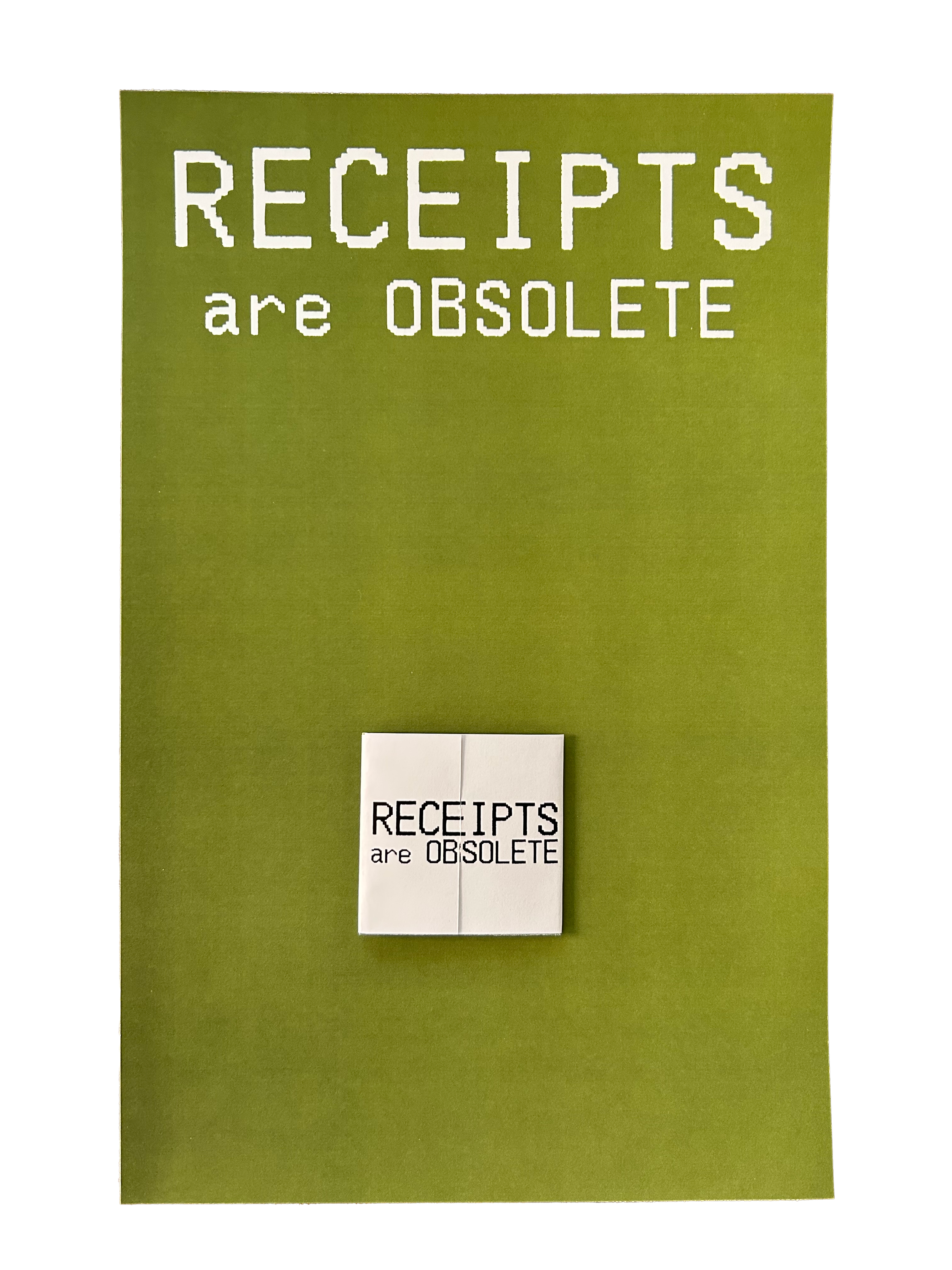
The final product was a combination of many elements from all the above, especially the way the concept boards evolved along the way. The typography choice with the image treatment gives it a realistic look. The crumpled effect is a reminder that in the end, receipts become trash, but where do they end up? And what are the environmental impacts?


